Balancing Client Demands and User Experience: A Personal Experience
Creating a seamless user experience (UX) is a fundamental goal of any successful website or app, particularly in the realm of ecommerce. However, UX designers sometimes encounter challenges when balancing client demands and user experience optimisation. I had the unfortunate experience with having to deal with such a situation, which I felt makes a pretty good case study about client demands and my know-hows in user experience.
The Client Request
The client’s main objective was clear: they wanted an e-commerce website that showcased a specific product, with several variables like different product type and countries. Additionally, there is one specific product is considered more premium, and would be worth highlighting. In fact, they even have a separate website just to sell that product alone. It is related to what they are selling on this website, though. So, in a way, it was worth having it highlighted here.
One specific request that was made was:
– Each product listing display an image, product description, and pricing,
and
– All that has to be done on the front page of the website.
While this seemed straightforward, I quickly realised that adhering to it would present challenges for the overall user experience. With the mass of information presented, browsing on mobile will be cumbersome. It also means that it will be harder for users to make choices, and that the user’s cognitive load when trying to compare prices will be too much.
Proposing a Solution
Having understood the importance of providing a seamless browsing experience, I proposed some solutions.
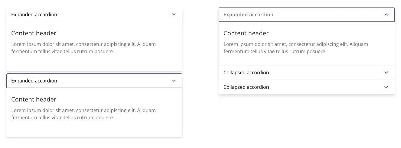
1. I suggested hiding the pricing information behind a expandable and collapsible accordian or toggle. This way, users could choose to view the details if they were interested, minimizing the need for excessive scrolling. I believed that this would enhance the overall user experience and make the website more user-friendly.
2. To capitalize on the prominence of their premium product, I suggested designing a section that would highlight this particular item. I proposed using a concise copy and a compelling call to action to draw attention to it. Additionally, I recommended positioning the remaining overseas-based products as secondary options for users to browse through.
This approach, I believe, would align with the user’s mental model and minimize decision overload.
Client Pushback

Expandable and collapsible toggles, also known as accordion menus or collapsible sections, are UI elements that allow users to reveal or hide additional content within a webpage or application. Photo Credit: Alex Bueno Design
Despite my well-intentioned suggestions, the client insisted on having the accordian toggle open by default. They argued that it was essential for sales conversion. They believed that showing the pricing information directly would , in fact, encourage users to make quicker purchasing decisions. While I understood their desire for high conversion rates, I expressed my concerns about compromising the user experience. Unfortunately, they remained steadfast in their opinion. (Note: they actually think that I designed it that way because just to make it “look nice” but it is “not practical in sales conversion”).
Furthermore, the client requested that both the premium and non-premium products receive equal emphasis on the website. They assumed that displaying a wide variety of products would be beneficial for users, without considering the potential drawbacks of Hick’s Law, which suggests that increased choices can lead to decision paralysis. I tried explaining the principle to them, emphasizing the importance of maintaining a clear focus and minimizing distractions, but they remained unconvinced.
While it is essential to consider the client’s perspective, decisions impacting UX should be based on evidence and user feedback. In this case, the client’s desire to open the toggle by default contradicted the best practices of UX design. Unfortunately, the client had not conducted any user testing to validate their assumptions about how the website’s design would impact sales conversions. While I emphasized the significance of conducting user research to inform design decisions, the client opted to move forward without this crucial step. This oversight prevented us from gathering valuable insights and addressing any usability concerns that might have arisen during testing.
Not the First, Won’t Be The Last
My experience with this website project highlighted the all-to-real challenges that can arise when trying to balance client demands and user experience principles. Despite my efforts to improve the user experience, certain decisions were made without considering the potential consequences.
Despite that, educating clients about the importance of user-centered design and advocate for research-backed decisions remains to be part of the UX designers’ responsibility. Pushbacks are part parcel of the effort. This incident certainly won’t discourage me from my responsibilities.
I mean, not everything I do deserve to be in my portfolio, anyway.

Armen R Rahman
Design & Communications
With nearly two decades of experience in the creative industry, Armen’s skill and talent covers a wide scope of endeavours; online and offline design work, film making, music production and writing are just some of his forte.
He considers good design as part of good communication (and vice versa!) and that the satisfaction can and should be derived at every point of the user experience, from the outreach messaging, the tech solution itself and the human touch at points of need.
In his spare time, he actively participates in foam dart flinging as a sport and music production as a downtime hobby.
